Outside satellite experts say investigators could be looking in the wrong ocean.

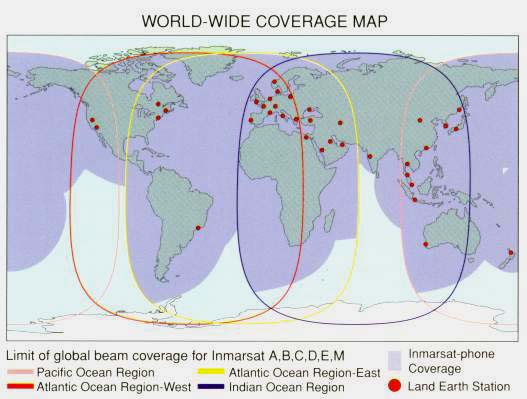
A map showing satellite communications company Inmarsat's global subscriptions. (Reuters)
Investigators searching for the missing Malaysian Airlines flight were ebullient when they detected what sounded like signals from the plane’s black boxes. This was a month ago, and it seemed just a matter of time before the plane was finally discovered.
But now the search of 154 square miles of ocean floor around the signals has concluded with no trace of wreckage found. Pessimism is growing as to whether those signals actually had anything to do with Flight 370. If they didn’t, the search area would return to a size of tens of thousands of square miles.
Even before the black-box search turned up empty, observers had begun to raise doubts about whether searchers were looking in the right place. Authorities have treated the conclusion that the plane crashed in the ocean west of Australia as definitive, owing to a much-vaunted mathematical analysis of satellite signals sent by the plane. But scientists and engineers outside of the investigation have been working to verify that analysis, and many say that it just doesn’t hold up.
A Global Game of Marco Polo
Malaysia Airlines flights are equipped with in-flight communications services provided by the British company Inmarsat. From early on, the lynchpin of the investigation has been signals sent by Flight 370 to one of Inmarsat’s satellites. It’s difficult to overstate the importance of this lonely little batch of “pings.” They’re the sole evidence of what happened to the plane after it slipped out of radar contact. Without them, investigators knew only that the plane had enough fuel to travel anywhere within 3,300 miles of the last radar contact—a seventh of the entire globe.
Inmarsat concluded that the flight ended in the southern Indian Ocean, and its analysis has become the canonical text of the Flight 370 search. It’s the bit of data from which all other judgments flow—from the conclusive announcement by Malaysia’s prime minister that the plane has been lost with no survivors, to the black-box search area, to the high confidence in the acoustic signals, to the dismissal by Australian authorities of a survey company’s new claim to have detected plane wreckage.
Although Inmarsat officials have described the mathematical analysis as “groundbreaking,” it’s actually based on some relatively straightforward geometry. Here’s how it works: Every so often (usually about once an hour), Inmarsat’s satellite sends a message to the plane’s communication system, asking for a simple response to show that it’s still switched on. This response doesn’t specify the plane’s location or the direction it's heading, but it does have some useful information that narrows down the possibilities.
You can think of the ping math like a game of Marco Polo played over 22,000 miles of outer space. You can’t see the plane. But you shout Marco, and the plane shouts back Polo. Based on how long the plane takes to respond, you know how far away it is. And from the pitch of its voice, you can tell whether it’s moving toward you or away from you—like the sound of a car on the highway—and about how fast.
This information is far from perfect. You know how far the plane was for each ping, but the ping could be coming from any direction. And you how fast the plane is moving toward or away from you. It could also be moving right or left, up or down, and the speeds would sound the same. The task of the Inmarsat engineers has been to take these pieces and put them together, working backwards to reconstruct possible flight paths that would fit the data.
What’s the Frequency?
There are two relevant pieces of information for each ping: the time it took to travel from plane to satellite, and the radio frequency at which it was received. It’s important to keep in mind that the transit times of the pings correspond todistances between satellite and plane, while frequencies correspond to relative speeds between satellite and plane. And this part’s critical: Relative speed isn’t the plane’s actual airspeed, just how fast it’s moving toward or away from the satellite.
Authorities haven’t released much information about the distances—just the now-famous “two arcs” graphic, derived in part from the distance of the very last ping. But they’ve released much more information about the ping frequencies. In fact, they released a graph that shows all of them:

This graph is the most important piece of evidence in the Inmarsat analysis. What it appears to show is the frequency shifts or “offsets”—the difference between the normal “pitch” of the plane’s voice (its radio frequency) and the one you actually hear.
The graph also shows the shifts that would be expected for two hypothetical flight paths, one northbound and one southbound, with the measured values closely matching the southbound path. This is why officials have been so steadfastly confident that the plane went south. It seems to be an open-and-shut verdict of mathematics.
So it should be straightforward to make sure that the math is right. That’s just what a group of analysts outside the investigation has been attempting to verify. The major players have been Michael Exner, founder of the American Mobile Satellite Corporation; Duncan Steel, a physicist and visiting scientist at NASA’s Ames Research Center; and satellite technology consultant Tim Farrar. They’ve used flight and navigation software like STK, which allows you to chart and make precise calculations about flight scenarios like this one. On their blogs and in an ongoing email chain, they’ve been trying to piece together the clues about Flight 370 and make sense of Inmarsat’s analysis. What follows is an attempt to explain and assess their conclusions.
What We Know
Although the satellite data provides the most important clues about the plane’s overall flight path, they’re not the only clues available. Authorities have some basic but crucial additional information about the flight that can help to make sense of the satellite math:
1. The satellite’s precise coordinates
The satellite in contact with Flight 370 was Inmarsat’s IOR satellite, parked in geostationary orbit above the Indian Ocean. The satellite is meant to be stationary, but its orbit has decayed somewhat, so that it actually rotates slightly around its previously fixed position. Its path is publicly available from the Center for Space Standards & Innovation.
2. The plane’s takeoff time and coordinates
16:41 UTC from the Kuala Lumpur airport.
3. The plane’s general motion toward or away from the satellite
From radar tracking, we know the plane traveled northeast, away from the satellite, over the first 40 minutes after takeoff, then westward, toward the satellite, until 94 minutes into the flight, when it was last detected on radar. Inmarsat spokesmen have stated that the ping distances got progressively longer over the last five hours of flight, meaning that the plane was moving away from the satellite during that time.
4. Two flight paths investigators think are consistent with the ping data
In addition to the frequency shift graph, the Inmarsat report includes a map with two “Example Southern Tracks,” one assuming a flight speed of 400 knots, the other a speed of 450 knots. Check it out:

These bits of knowledge allow us to put some basic constraints on what a graph of the ping frequency shifts should look like. We’ll use more precise numbers later; for now, it’s helpful just to have some qualitative sense of what to expect:
5. Frequency shifts that should all be negative
When the plane is moving away from the satellite, the radio signal gets stretched out, so the frequency decreases. This means that the frequency shifts should be negative over most of the flight. Although there was an approximately one-hour period starting 40 minutes after takeoff when radar showed the plane moving westward, toward the satellite, the graph shows that no pings were sent during that time—so actually, all of the shifts on the graph should be negative.
6. Frequency shifts before takeoff that should be near zero
Plotting the satellite’s path in STK, you can see that it moves through an ellipse centered around the equator. Space scientist Steel has created this graphic of the satellite’s motion, including marks for its position when the plane took off and when it last pinged the satellite:

The satellite’s motion is almost entirely north-south, and the plane’s takeoff location in Kuala Lumpur is almost due east of the satellite. This means that the satellite was only barely moving relative to Kuala Lumpur, so the frequency shift for a plane nearly stationary on the ground at the airport would be nearly zero.
7. Frequency shift graph should match map of southbound flight paths
The way the Marc-Polo math works is that, if you assume the plane traveled at some constant speed, you can produce at most one path north and one path south that fit the ping data. As the example flight paths on Inmarsat’s map show, the faster you assume the plane was moving overall, the more sharply the path must arc away from the satellite.
This constraint also works the other way: Since flight paths for a given airspeed are unique, you can work backwards from these example paths, plotting them in STK to get approximate values for the ping distances and relative speeds Inmarsat used to produce them. The relative speeds can then be converted into frequency shifts, which should roughly match the values on the frequency graph. (This is all assuming that Inmarsat didn’t plot the two example paths at random but based on the ping data.) We’ll put more precise numbers on this below.
The Troubled Graph
But the graph defies these expectations. Taken at face value, the graph shows the plane moving at a significant speed before it even took off, then movingtoward the satellite every time it was pinged. This interpretation is completely at odds with the official conclusion, and flatly contradicted by other evidence.
The first problem seems rather straightforward to resolve: the reason the frequency shifts aren’t negative is probably that Inmarsat just graphed them as positive. Plotting absolute values is a common practice among engineers, like stating the distance to the ocean floor as a positive depth value rather than a negative elevation value.
But the problem of the large frequency shift before takeoff is more vexing. Exactly how fast does the graph show the plane and satellite moving away from each other prior to takeoff?
The first ping on the graph was sent at 16:30 UTC, eleven minutes prior to takeoff. The graphed frequency shift for this ping is about -85 Hz. Public recordsshow that the signal from the plane to the satellite uses a frequency of 1626 to 1660 MHz. STK calculations show the satellite’s relative motion was just 2 miles per hour toward the airport at this time. Factoring in the satellite’s angle above the horizon, the plane would need to have been moving at least 50 miles per hour on the ground to produce this frequency shift—implausibly high eleven minutes prior to takeoff, when flight transcripts show the plane had just pushed back from the gate and not yet begun to taxi.
On the other side of the frequency graph, the plane’s last ping, at 00:11 UTC, shows a measured frequency shift of about -252 Hz, working out to a plane-to-satellite speed of just 103 miles per hour. But the sample southbound paths published by Inmarsat show the plane receding from the satellite at about 272 miles per hour at this time.
In other words, the frequency shifts are much higher than they should be at the beginning of the graph, and much lower than they should be at the end. Looking at the graph, it’s almost as if there’s something contributing to these frequency shift values other than just the motion between the satellite and the plane.
Cracking the 'Doppler Code'
Exner, an engineer who’s developed satellite and meteorology technologies since the early 1970s, noted that the measured frequency shifts might come not just from each ping’s transmission from plane to satellite, but also from the ping’s subsequent transmission from the satellite to a ground station that connects the satellites into the Inmarsat network. In other words, Exner may have found the hidden source that seems to be throwing off the frequency graph.
Inmarsat’s analysis is highly ambiguous about whether the satellite-to-ground transmission contributed to the measured frequency shift. But if it did, a ground station located significantly south of the satellite would have resulted in frequency shifts that could account for the measured shifts being too large at the beginning of the graph and too small at the end. And sure enough, Inmarsat’s analysis states that the ground station receiving the transmission was located in Australia.
It’s possible to check the theory more precisely. Public records of Inmarsat ground stations show just one in Australia: in Perth. Using STK, you can precisely chart the satellite’s speed relative to this station, and, using thesatellite-to-ground signal frequency (about 3.6 GHz), you can then factor the satellite-to-ground shifts out of the frequency graph. Finally, you can at last calculate the true satellite-to-plane speed values.
The results seem to be nearly perfect. For the first ping, you wind up with a satellite-to-plane speed of about 1 mile per hour—just what you’d expect for a plane stationary or slowly taxiing eleven minutes before takeoff. This finding seems to provide a basic sanity check for interpreting the graph, and led Exner to declare on Twitter, “Doppler code cracked.” He produced a new graph of the frequency shifts, shown below. The gently sloping blue line shows the shifts between the satellite and the ground station in Perth, while the dotted red line shows the newly calculated satellite-to-plane shifts:

Why Inmarsat’s Analysis Is Probably Wrong
If this interpretation—based on the work of Exner, Steel, Farrar, and myself—is correct, it would allow independent experts to fully review Inmarsat’s analysis, verify its work and check to see if Inmarsat might have missed any important clues that could further narrow down the plane’s whereabouts.
The problem is, although this interpretation matches two basic expectations for the frequency graph, it still doesn’t match Inmarsat’s example flight paths. The new frequency values, calculated by Exner, show the flight’s speed relative to the satellite as only about 144 miles per hour by the last ping, but Inmarsat’s example flight paths show a relative speed of about 272 miles per hour.
It’s possible these outside experts have still erred or missed some crucial detail in their attempts to understand the Inmarsat analysis. But that just means that Inmarsat’s analysis, as it has been presented, remains deeply confusing, or perhaps deeply confused. And there are other reasons to believe that Inmarsat’s analysis is not just unclear but mistaken. (Inmarsat stands by its analysis. More on that in a minute.)
Recall that the Marco-Polo math alone doesn’t allow you to tell which direction pings are coming from. So how could Inmarsat claim to distinguish between a northern and southern path at all? The reason is that the satellite itself wasn’t stationary. Because the satellite was moving north-south, it would have been moving faster toward one path than another—specifically, faster toward a southbound track than a northbound one over the last several hours of the flight. This means that the frequency shifts would also differ between a northbound and southbound path, as the graph shows with its two predicted paths.
But this is actually where the graph makes the least sense. The graph only shows different predicted values for the north and south tracks beginning at 19:40 UTC (presumably Inmarsat’s model used actual radar before this). By this time, the satellite was traveling south, and its southward speed would increase for the rest of the flight. The frequency shift plots for northern and southern paths, then, should get steadily further apart for the rest of the flight. Instead, the graph shows them growing closer. Eventually, they even pass each other: by the end of the flight, the graph shows the satellite traveling faster toward a northbound flight path than a southbound one, even though the satellite itself was flyingsouth.
One ping alone is damning. At 19:40 UTC, the satellite was almost motionless, having just reached its northernmost point. The graph shows a difference of about 80 Hz between predicted northbound and southbound paths at this time, which would require the satellite to be moving 33 miles per hour faster toward the southbound path than the northbound one. But the satellite’s overall speed was just 0.07 miles per hour at that time.
Inmarsat claims that it found a difference between a southbound and northbound path based on the satellite’s motion. But a graph of the frequency shifts along those paths should look very different from the one Inmarsat has produced.
Losing Faith
Either Inmarsat’s analysis doesn’t totally make sense, or it’s flat-out wrong.
For the last two months, I’ve been trying to get authorities to answer these questions. Malaysia Airlines has not returned multiple requests for comment, nor have officials at the Malaysian Ministry of Transportation. Australia’s Joint Agency Coordination Centre and the UK’s Air Accidents Investigation Branch, which have been heavily involved in the investigation, both declined to comment.
An Inmarsat official told me that to “a high degree of certainty, the proponents of other paths are wrong. The model has been carefully mapped out using all the available data.”
The official cited Inmarsat’s participation in the investigation as preventing it from giving further detail, and did not reply to requests for comments on even basic technical questions about the analysis. Inmarsat has repeatedly claimed that it checked its model against other aircrafts that were flying at the time, and peer-reviewed the model with other industry experts. But Inmarsat won’t say who reviewed it, how closely, or what level of detail they were given.
Until officials provide more information, the claim that Flight 370 went south rests not on the weight of mathematics but on faith in authority. Inmarsat officials and search authorities seem to want it both ways: They release charts, graphics, and statements that give the appearance of being backed by math and science, while refusing to fully explain their methodologies. And over the course of this investigation, those authorities have repeatedly issued confident pronouncements that they’ve later quietly walked back.
The biggest risk to the investigation now is that authorities continue to assume they’ve finally found the area where the plane went down, while failing to explore other possibilities simply because they don’t fit with a mathematical analysis that may not even hold up.
After all, searchers have yet to find any hard evidence—not so much as a shred of debris—to confirm that they’re looking in the right ocean.